2x Grid
Under the hood
The IBM 2x Grid system is a fully responsive, robust, 16 column layout system with five default breakpoints and dozens of predefined classes.
Our grid is built with Flexbox and closely mirrors Bootstrap’s grid in that it uses containers, rows and columns to layout and align content. Below is an in-depth look at how it all comes together.
If you’re new to Flexbox, this CSS Tricks Flexbox guide will provide more detail around everything from basic terminology to code.
Getting started
With Carbon-components
We provide multiple ways for you to use the grid for the Carbon Design System. By default, the grid code is included when you use carbon-components. To get started, you’ll need to install this package using npm:
npm install carbon-components --save
Or, if you prefer Yarn:
yarn add carbon-components
You can include the grid in one of two ways:
// If you're including all the styles for Carbon@import "carbon-components/scss/globals/scss/styles.scss";// If you're wanting to import the grid@import "carbon-components/scss/globals/grid/grid";
To use 16 column variant of the grid, you need to enable the grid-columns-16 feature flag before including any imports in your Sass files. For example:
$feature-flags: (grid-columns-16: true,);// If you're including all the styles for Carbon@import "carbon-components/scss/globals/scss/styles.scss";// If you want to import the grid@import "carbon-components/scss/globals/grid/grid";
Without Carbon-components
If you’d like to use the grid without including carbon-components, we offer the @carbon/grid package. You can install this with npm:
npm install @carbon/grid --save
Or, if you prefer Yarn:
yarn add @carbon/grid
You can then include the 16 column grid by doing the following in your Sass files:
@import "@carbon/grid/scss/grid";
How it works
We won’t spend a lot of time here recapping the basics of the Bootstrap grid. Instead we’ll emphasize the features that make this system unique, especially concerning gutter structure, type alignment, and the UI Shell.
Basic grid explainer
The below example creates four equal-width columns at small, medium, large, and extra large breakpoints using our predefined grid classes. The columns are centered in the page within the parent container.
<div class="bx--grid"><div class="bx--row"><div class="bx--col">1 of 4</div><div class="bx--col">2 of 4</div><div class="bx--col">3 of 4</div><div class="bx--col">4 of 4</div></div></div>
Container
bx--grid defines the overall grid context at the top level and applies the proper margin and our default max-width (1584px.) You can also remove this max width, by using a grid modifier class. See the full width example below.
Rows
bx--row defines a row of items inside the grid — think of rows as wrappers for columns. Each column has horizontal padding (aka a gutter) that defines the space between them. You can negate this padding at the row level with negative margins, allowing the content within your columns to be aligned along the left side.
Columns
bx--col defines individual columns inside a row. Use as many columns as you’d like out of the possible 16 per row. With Flexbox columns widths are set in percentages relative to their parent element so columns without a spec’d width will automatically be equal. For example, four instances of bx--col will will give you four equal width columns — each 25% of the parent from the small breakpoint on up. See the auto-layout columns for more on this.
Responsive options
| Breakpoints | Class prefix | # of cols | Gutter width* |
|---|---|---|---|
| Small (<320) | .bx--col-sm- | 4 | 32px |
| Medium (≥672) | .bx--col-md- | 8 | 32px |
| Large (≥1056) | .bx--col-lg- | 16 | 32px |
| X-Large (≥1312) | .bx--col-xlg- | 16 | 32px |
| Max (≥1584) | .bx--col-max- | 16 | 32px |
* Gutter width is 32px — with 16px on each side of a column — at every breakpoint.
Responsive classes
Here’s a look at all the width classes available for our 16 column grid. Use the column helpers to specify different column spans at different widths.
If you want to change it up, use a combination of different classes for each grid tier as needed. See the markup below. Note: 3 and 5 column arrangements are discouraged, however, in specific instances, you are allowed to generate a three columns within our system.
<div class="bx--grid"><div class="bx--row"><div class="bx--col-lg-16">16</div></div><div class="bx--row"><div class="bx--col-lg-15 bx--col-md-7 bx--col-sm-3">15</div><div class="bx--col-sm-1 bx--col-md-1 bx--col-lg-1">1</div></div><div class="bx--row">

Do feel free to mix and match column structure.

As a general rule, don’t mix with 3 or 5 columns.
Equal width columns
Use these classes for easy column sizing when you want to maintain the same grid tiers at every breakpoint. In the example below, the grid layouts apply to every breakpoint: from sm to max. Add any number of unit-less classes per row you need and every column will be the same width.
<div class="bx--grid"><div class="bx--row"><div class="bx--col">1 of 8</div><div class="bx--col">1 of 8</div><div class="bx--col">1 of 8</div><div class="bx--col">1 of 8</div><div class="bx--col">1 of 8</div><div class="bx--col">1 of 8</div><div class="bx--col">1 of 8</div>
Grid modes
Carbon’s Sketch templates always have a 32px gutter by default, regardless of breakpoint. The default gutter width is 32px because type, within or without containers, never has less than a 32px gutter. For containers and components, however, there are three different gutter structures: Wide (default), Narrow and Condensed. These three gutter scenarios enable typographic alignment by allowing containers and certain components to “hang” into the gutter.
Wide (default)
32px gutter

Narrow
16px gutter

Condensed
2px gutter

The Wide grid
This is our default grid mode, with 16 columns and 32px gutters. Unless your design specifies something different, this is the grid you should go with — it’s also arguably the easiest to use. Here, the container edge does not extend into the gutter, so the type within the container does not sit on the columns.
Rows that are adjacent will have 32px of margin between them to match gutter. Use vertical helpers here.
<div class="bx--grid"><div class="bx--row"><div class="bx--col"></div><div class="bx--col"></div><div class="bx--col"></div><div class="bx--col"></div></div></div>
Usage
Use the Wide grid mode when you are dealing with separate pieces of information with separate destinations. This grid mode is also good for text-heavy situations, where maximum breathing room helps provide clarity and legibility. Also, basic images (without text on them) always use this grid mode.
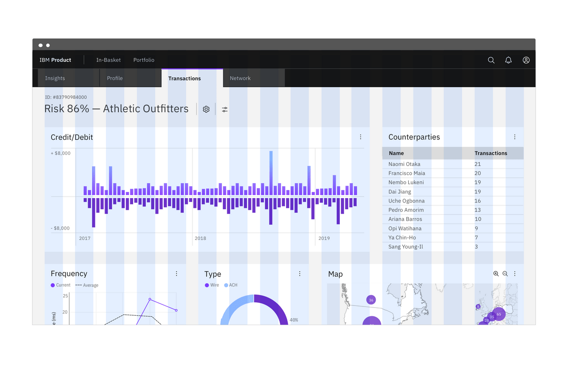
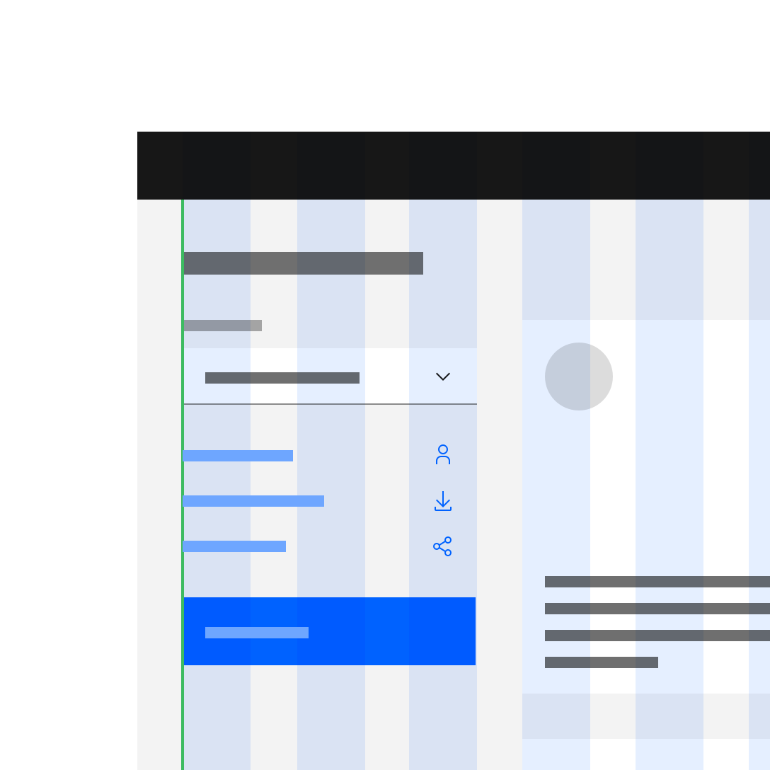
Do align type (outside of a container), components, and tiles to the columns.
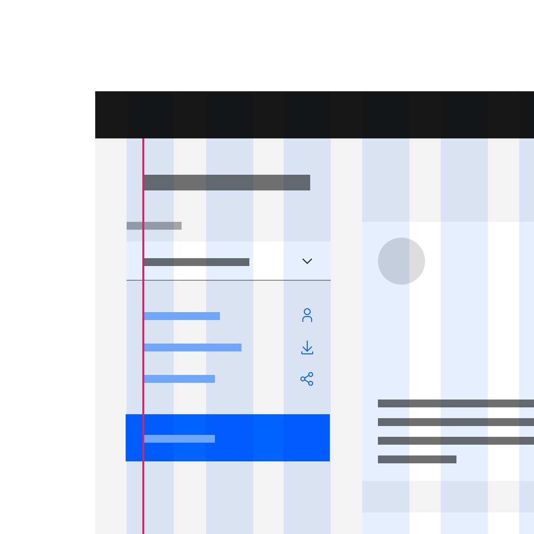
Do not take type off the column structure to achieve alignment.
The Narrow grid
This is the gutter scenario that requires the most explanation. Although it’s caused a lot of confusion, the intent is simply to enable more typographic alignment. With the Narrow grid, the container, not the type, hangs 16px into the gutter; allowing headings and copy outside of containers to align with the copy within containers and components. This arrangement can easily be mirrored to accomodate languages that read right to left, like Arabic or Hebrew.
Rows that are adjacent will have 16px of margin between them to match gutter. Use vertical helpers here.
Usage
Use the Narrow grid mode when you are dealing with separate pieces of information with separate destinations, but would like to save more real estate. This grid mode will give your compositions a sleeker look and maximize type alignment, within and without containers.
As mentioned above, fixed components with labels, such as input fields and dropdowns, should not hang into the gutter. See an example of how to combine a Wide and a Narrow grid scenario in the Mix and match section.
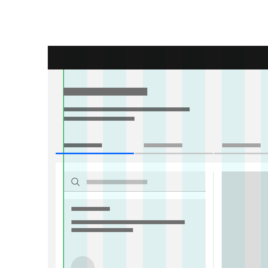
Do align components within containers flush to the columns.
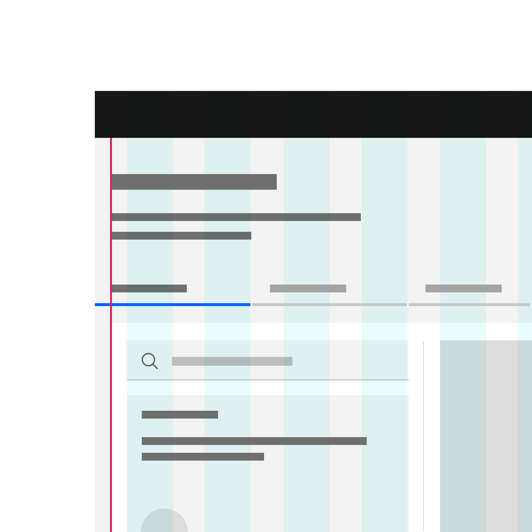
Do not hang type into the gutter under any circumstances.
The Condensed grid
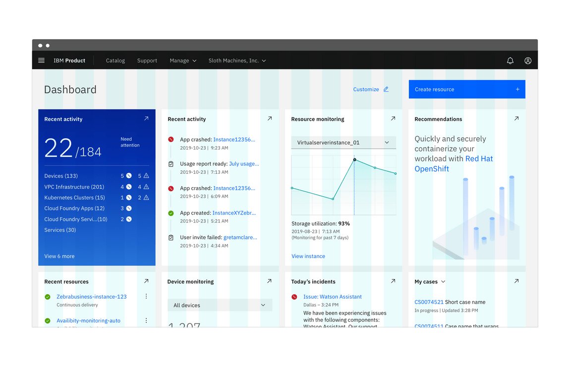
The Condensed grid collapses the gutter to 2px. To achieve this, containers and components bleed 16px into the gutter on either side of the column. This grid mode is most often used in conjunction with another grid mode and arguably requires the most design skill to incorporate into layouts.
Rows that are adjacent will have a 2px of margin between them to match gutter. Use vertical helpers here.
<div class="bx--grid bx--grid--condensed"><div class="bx--row"><div class="bx--col"></div><div class="bx--col"></div><div class="bx--col"></div><div class="bx--col"></div></div></div>
Usage
When you have separate pieces of information that form a larger picture, like a dashboard or an overview page, that’s a good time to use the Condensed grid. You’ll also see this grid mode in portals, resource tiles and other introductory UI. See it in action on the IBM Design Language homepage.
As mentioned above, fixed components with labels, such as input fields and dropdowns, should not hang into the gutter.
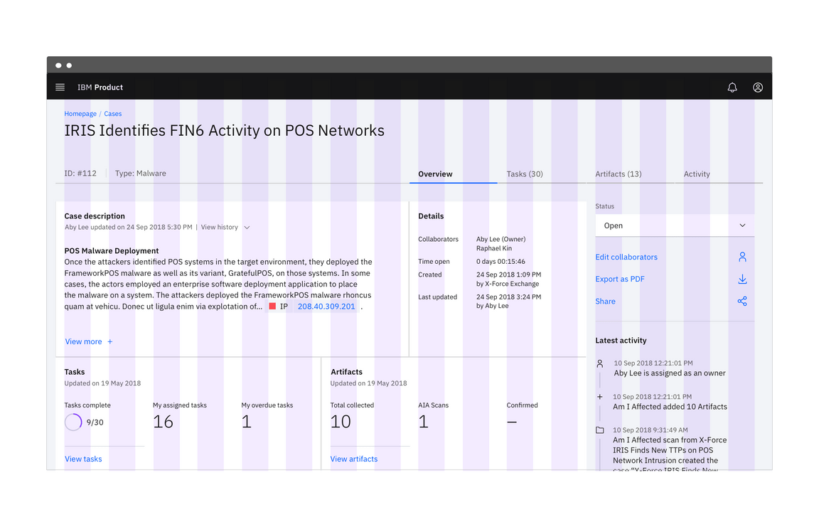
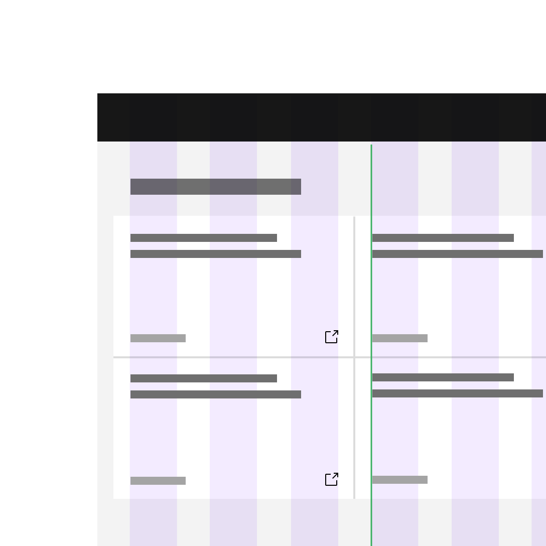
Do keep all type (inside and outside containers) aligned with the column grid.
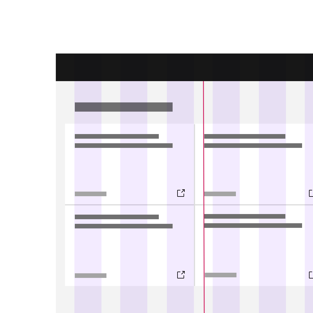
Do not hang type into the gutter under any circumstances.
Mix and match
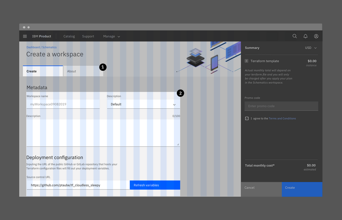
You can use rows to mix and match grid modes. In this situation, margin bottom between the rows can vary. Because of scenarios like input fields where the label text doesn’t align to the input text — both the Narrow grid mode and the Condensed grid are most often used in conjunction with the Wide grid mode.
Usage
Unless you’re using the Wide grid mode exclusively, mixing and matching is going to be the rule rather than the exception on most platforms — especially since our labeled components (input fields, dropdowns etc.) require a 32px gutter. We’ve provided a couple of examples below and will keep adding helpful uses cases as we find them.
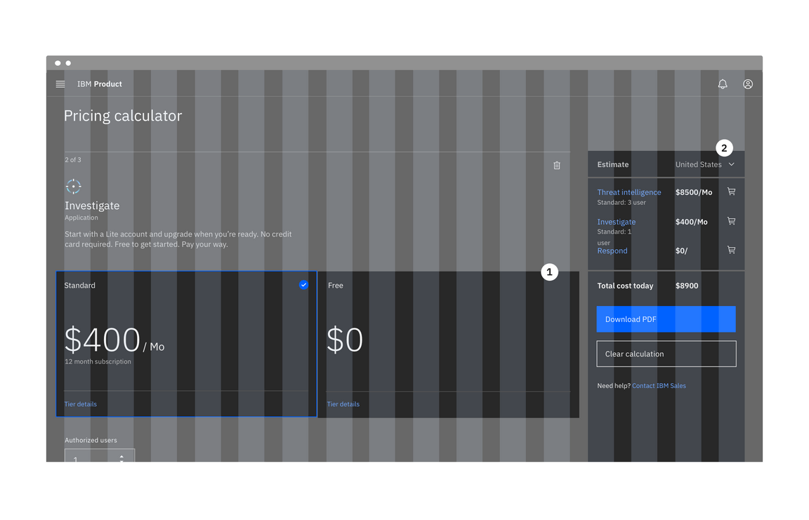
1. Condensed grid mode
2. Wide grid mode
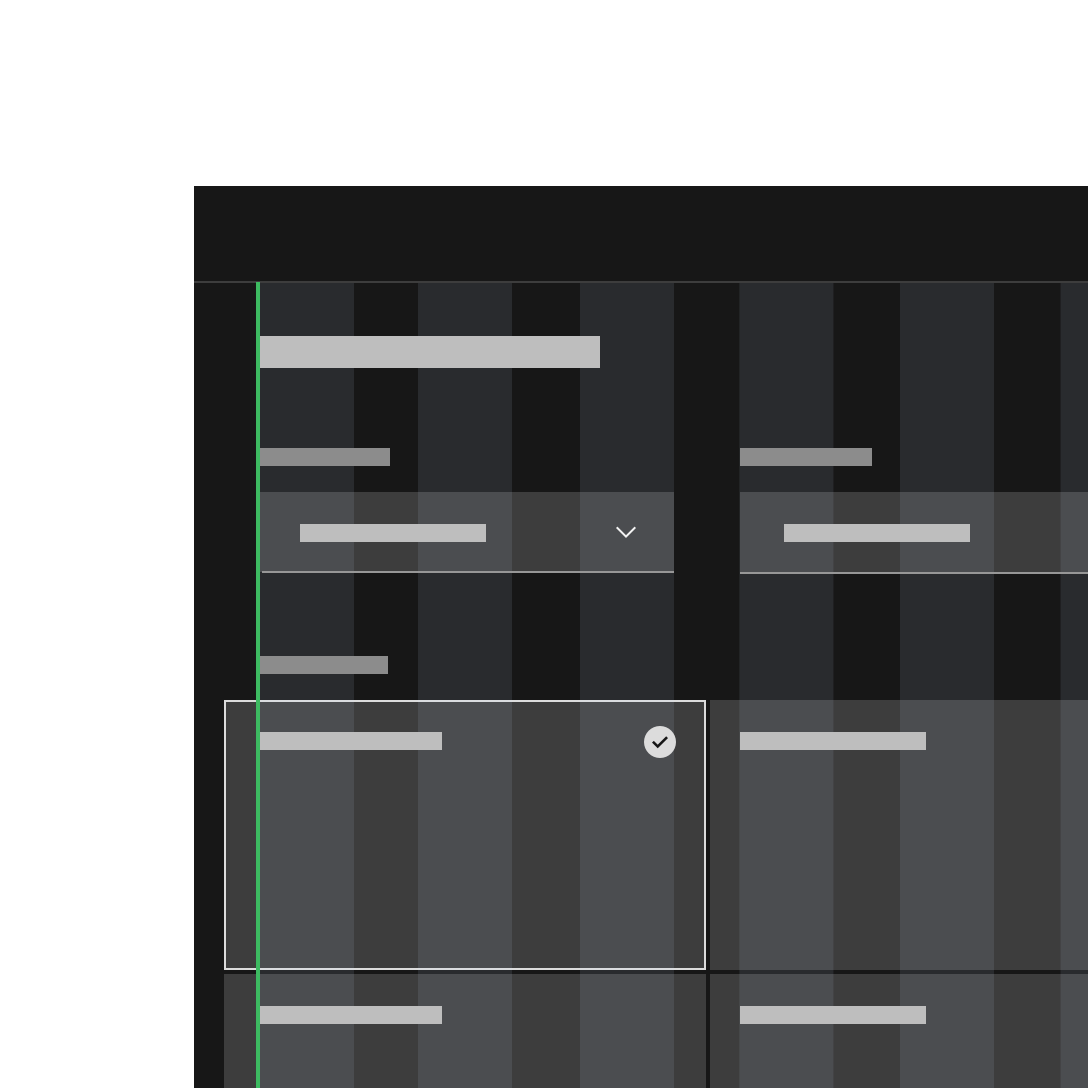
Do apply different grid modes to different components (like input fields with labels and tiles).
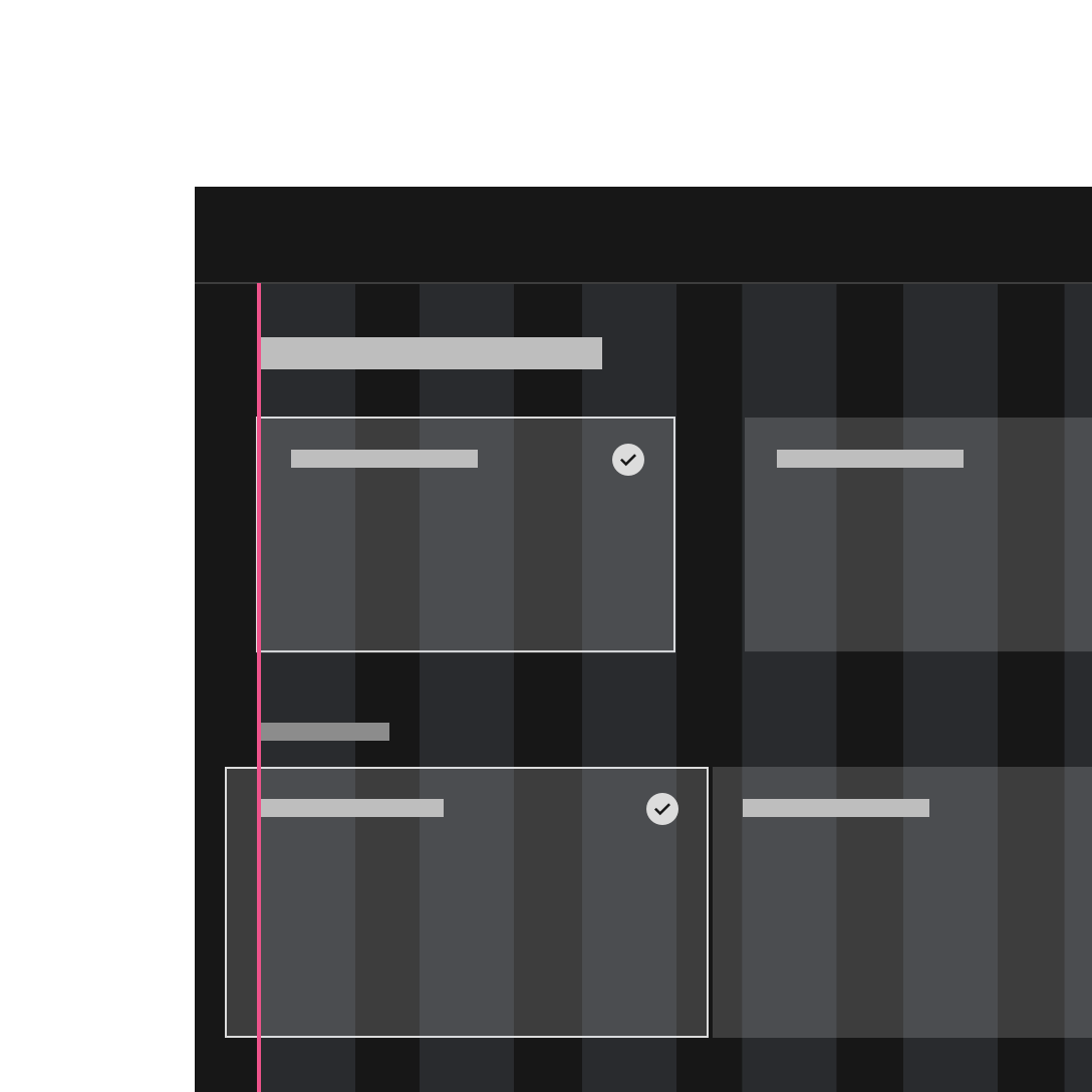
Do not apply different grid modes to the same component on the same page.
1. Condensed grid mode
2. Wide grid mode
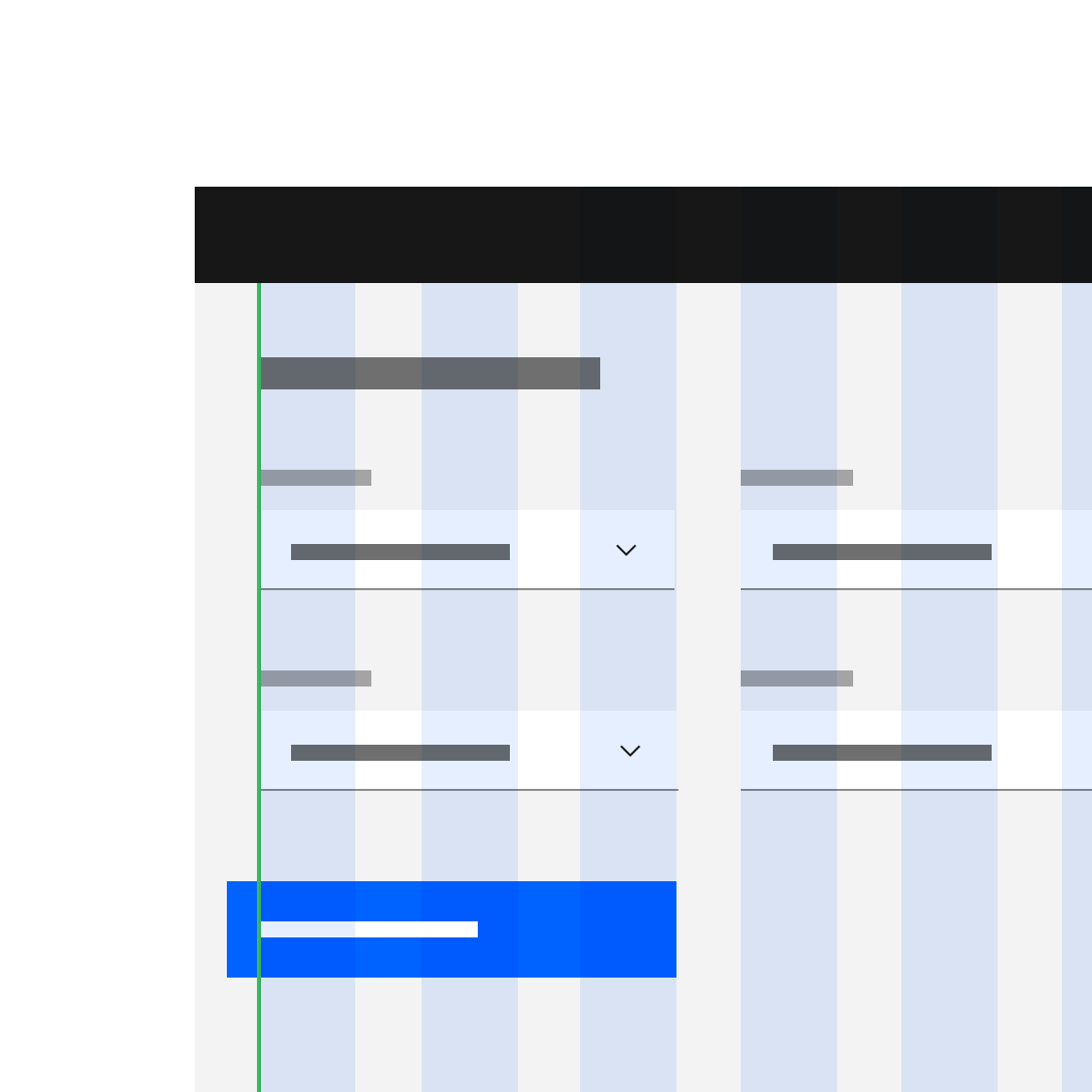
Do apply different grid modes to different components (like input fields with labels and tiles).
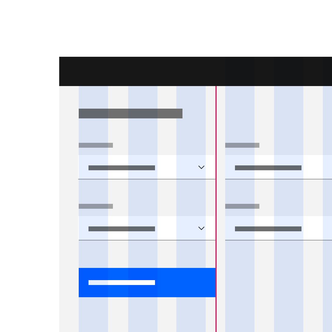
Do not apply different grid modes to the same component on the same page.
Incorporating the Shell
We cover more about shell behavior on the 2x Grid Basics tab in the Grid influencers section. However, we’ve had a lot of questions about how the shell works in conjunction with our grid. That’s why we recently incorporated the shell into our grid tooling as a Sketch template. We’d also like to show it in action here in a product.
<aside class="side-nav"><!-- Toggle side-nav--expanded class above --></aside><div class="bx--grid"><!-- ... --></grid>
<aside class="side-nav--expanded"><!-- Toggle side-nav--expanded class above --></aside><div class="bx--grid"><!-- ... --></grid>
Usage
The most commonly used product shell is the flexible panel. The collapsed flexible panel expands when the user hovers over any portion of it. When flexible panels expand, they either condense both the content and the grid or they push content beyond the edge of the browser.
Alignments
Offsetting
Use offset classes to offset content by a given column span. These classes increase the left margin of a column by * columns. For example, bx—offset-lg-8 moves bx—col-lg-8 over eight columns.
<div class="bx--grid"><div class="bx--row"><divclass="bx--offset-lg-15 bx--col-lg-1 bx--offset-md-7 bx--col-md-1 bx--offset-sm-3 bx--col-sm-1">1</div></div><div class="bx--row">
Vertical spacing
We intend to add a demo on vertical spacing soon, along with more guidance and examples around key heights and spacers.
Techniques
Full bleed content
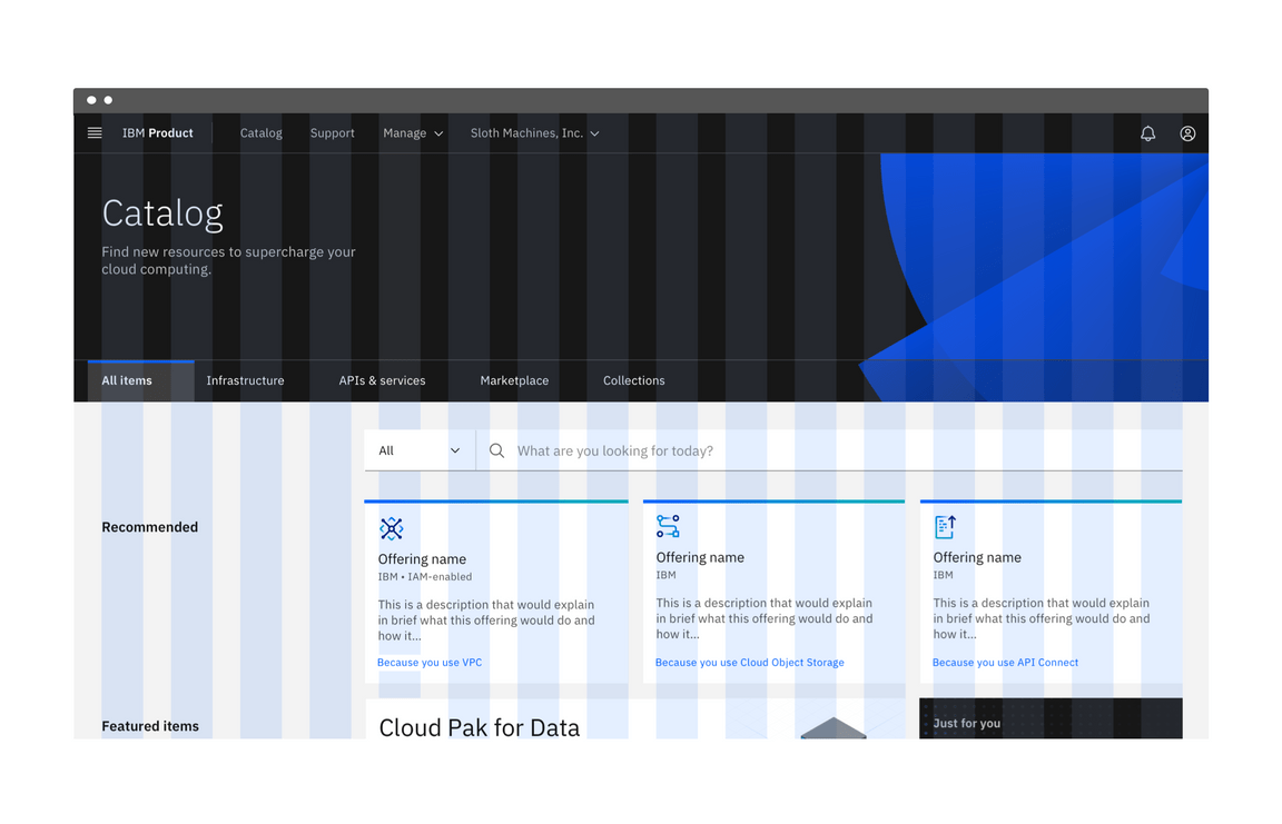
By default, the grid maintains a max width of 1584px, but allows content to span infinitely. When you want background colors or an image to go edge-to-edge, you will need to create a wrapping node around your grid with the color that you are looking to apply. In this example, we create an outer div and give it the class name bleed which we then style with a background color.
If you want to remove the default max width, you can do it by using a grid modifier class. This will allow your grid to span infinitely.
<div class="bleed"><div class="bx--grid"><div class="bx--row"><div class="bx--col"></div><div class="bx--col"></div><div class="bx--col"></div><div class="bx--col"></div></div></div>
Usage
Aspect ratios
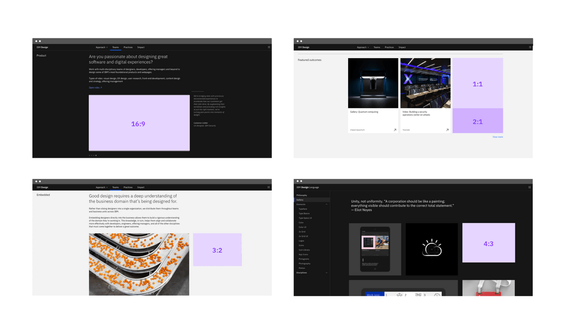
When designing fluid layouts, it’s helpful for an asset or card to be a specific aspect ratio. We offer several classes for specifying aspect ratio for given content. We use these classes to maintain consistency throughout our UI.
We discuss aspect ratios and various grid behaviors more in depth on the 2x Grid Basics tab, both in the Aspect ratios section and in the Grid behaviors section.
<div class="bx--aspect-ratio bx--aspect-ratio--2x1"><div class="bx--aspect-ratio--object">2x1</div></div><div class="bx--aspect-ratio bx--aspect-ratio--16x9"><div class="bx--aspect-ratio--object">16:19</div></div><div class="bx--aspect-ratio bx--aspect-ratio--4x3">
Basic usage
We understand that when using responsive grid classes, it’s not always possible for every image or container to be one of these sizes. However it’s important to use them to set the foundation of your layouts, especially in the case of same size tiles.
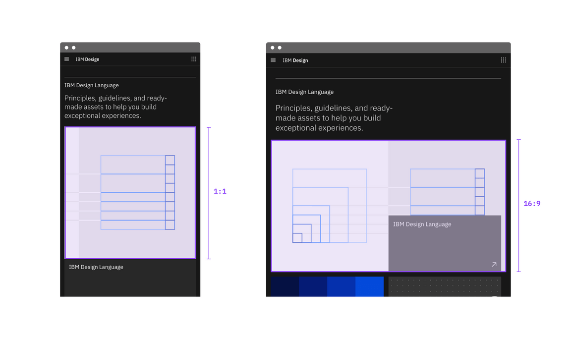
Adaptability
Image size can change ratios when the breakpoint changes.
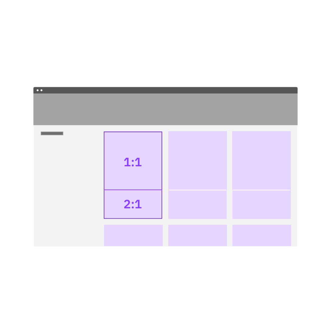
When combining tiles, or tiles and images, do give each a designated aspect ratio.
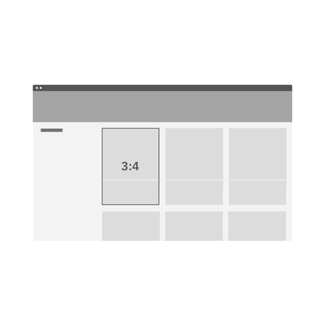
Do not shoe-horn each tile / tile and image into a combined aspect ratio.
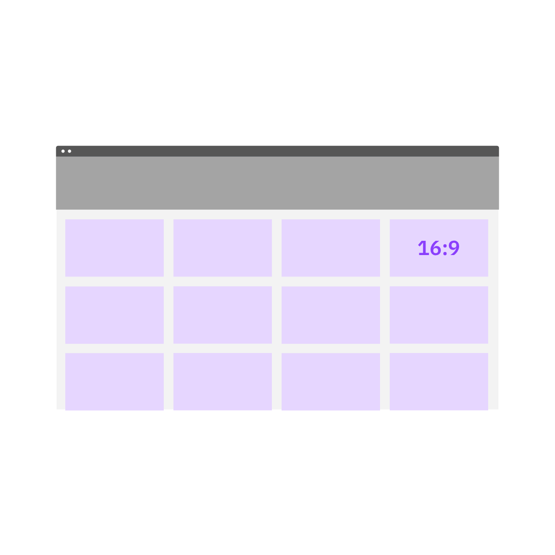
Do use a designated aspect ratio for a grid of same-size fixed ratio tiles.
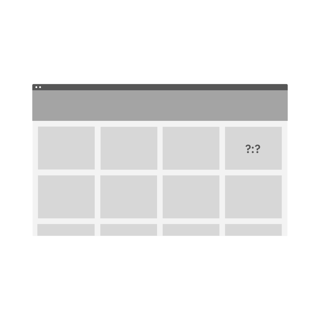
Do not start with a random aspect ratio for a grid of same-size fixed ratio tiles.