UI shell left panel
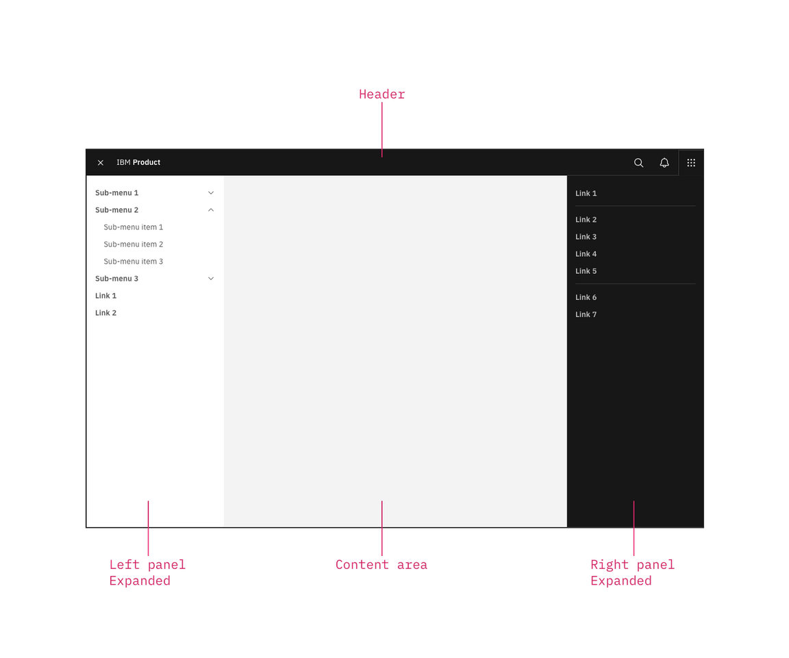
This left panel is part of the Carbon UI shell. A shell is a collection of components shared by all products within a platform. It provides a common set of interaction patterns that persist between and across products.
Resources
General guidance
The UI shell is made up of three components: The header, the left panel, and the right panel. All three can be used independently, but the components were designed to work together.
| Shell UI component | |
|---|---|
| Header | The highest level of navigation. The header can be used on its own for simple products or be used to trigger the left and right panels. |
| Left panel | An optional panel that is used for a product’s navigation. |
| Right panel | An optional panel that shows additional system level actions or content associated with a system icon in the header. |

UI shell components
Anatomy
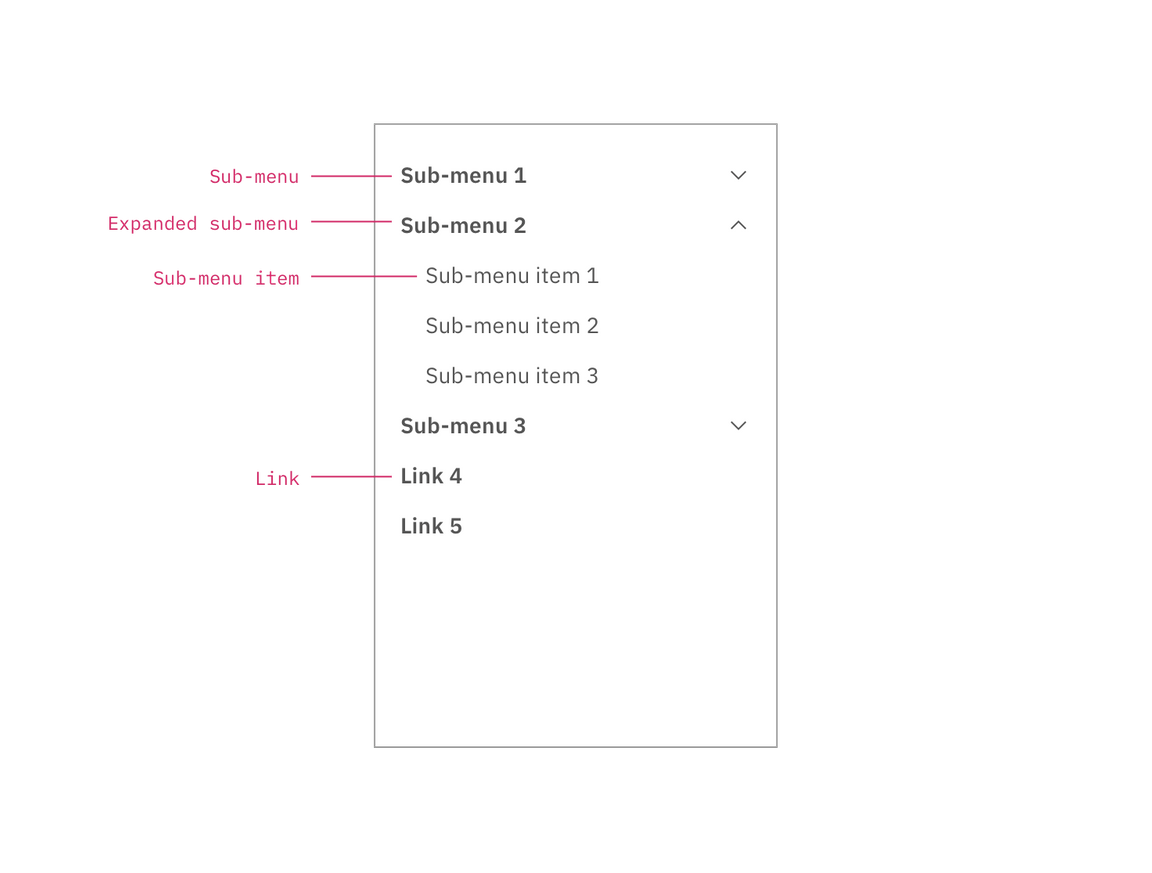
The left panel contains secondary navigation and is positioned below the header and fixed to the left. Both links and sub-menus can be used in the side-nav and may be mixed together.

Left panel with nested sub-menus.
Behavior
Use the left panel if there are more than five secondary navigation items, or if you expect a user to switch between secondary items frequently. Sub-menus are denoted with a chevron and expand when clicked, pushing the other items down in the panel. To collapse the sub-menu, the user must again click the menu header in the left panel.
The left panel does not support three tiers of navigation. If you have additional content to display beneath a sub-menu, use tabs within the page.